Posts

How To Choose The Right Font For Your Logo?

Image
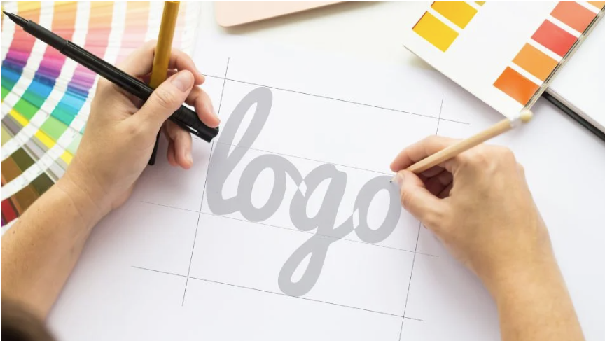
Whether you’re outsourcing logo design to a professional or creating one yourself, you should know how to choose the font. Even if you use a large icon, the text part of your logo will play a major role, as it will spell out your company name. Choosing the right font for your new logo is imperative. It won’t only make your logo easy to read even at small sizes, but it will also convey your brand tone and values and represent you as a whole. Font Types Before narrowing down to one particular font, you should know which types of fonts exist and what they convey. Although there are many more font types, these are the five main ones: Serif fonts: These have small lines or “feet” at the end of each letter stroke and are generally considered more traditional and formal. They are often used in the logos of finance, law, and publishing companies because they are seen as reliable, traditional, and sophisticated. They convey stability and reliability and are often used in logos for established o

10 logo design trends

Image
Logos, like everything else, have trends. It is useful to follow them so that the logo looks relevant and does not seem outdated compared to competitors. We tell you what will be fashionable in 2023. Trend 1. Gradient The gradient does not lose ground and remains fashionable for several years now. In 2023, the gradient will also be relevant, so it should be safely used in logos. The gradient is suitable for any company, especially those who seek to demonstrate modernity and manufacturability. Trend 2. Subdued colors A notable trend for 2023 is muted, dusty colors. In a year full of unpleasant events in the world, people want peace, harmony and softness, at least in color. When choosing muted colors for the logo, it is better to choose a shade that is close to natural. This color scheme is especially suitable for companies broadcasting a commitment to sustainability. Trend 3. Non-standard geometry In 2023, logos that feature geometric patterns in an unusual way will be trendy. For examp

How to distinguish bad design from good design

Image
This article collects observations about bad and good design. They apply to everything from logos and websites to urban elements. We tell you how to evaluate someone else's design and what to think about before creating your own. Theory There is a saying that good design is beautiful design. Sounds logical, but it's a little more complicated. Beauty is a relative concept. In 1785, such a dress was considered beautiful: And in 2022 - this: If we imagine that a fashion designer flew to people from the 18th century in a time machine and showed a dress from 2022, no one would like the design of this dress. For the 18th century, this thing is too strange, there is nowhere to put it on, it looks out of place at all events. Because of this, no one would simply see her beauty. Good design is practical, not aesthetic. It has three characteristics: • context; • contrast; • content. Context Without context, it is impossible to understand whether a design is good or bad, whether it works o

What to shoot in winter for sale on stocks

Image
Any time of the year is in demand on stocks. Here are a few winter stock photo ideas for those looking for inspiration and a fresh look. 📷 Winter sports. Sports equipment, sportswear, people involved in winter sports, skiing, skating, alpine skiing, bobsleigh, skeleton, sledges, figure skating, curling, hockey; 📷 Winter activities. Outdoor games, sledding and bunting down the hill, figure skating on the pond, playing snowballs, building a snowman or a fortress, winter fishing; 📷 Winter nature. Landscapes, trees in the snow, snow-covered Christmas trees, sketches from rural life and forest tales. 📷 Winter holidays. Postcards for Christmas and New Year, unpacking of gifts, interiors with a fireplace and garlands, Christmas tree decoration; 📷 Winter cooking. Baking gingerbread, decorating gingerbread houses, pouring punch and grog, roasting duck in cranberry sauce; 📷 Winter portraits. Photos of people are always in demand on stocks, so in winter we also take pictures of people. Port

Seven mistakes in logo design

Image
This article is for those who order a logo and do not know how to evaluate the quality of its design. Now we will talk about the seven most common mistakes. If there are more than two of them in the finished logo, it is better to redo it all over again. Misake #1: Composition Unsuccessful compositions are visible even to non-professionals. Asymmetry, elements that are too close or too far away, and falling parts of the logo are immediately noticeable. One of the common compositional errors is the incorrect arrangement of elements. UBS company logo Mistake #2: Colors Color problems in logos arise for a variety of reasons: too much or too little contrast, saturation, or mismatched hues. The following are the main errors related to colors. Too many colors in the logo For more information about choosing colors, see the article “How to choose a logo color”. Bad color combinations When creating a logo that has several colors, it makes sense to use a color palette - this is a special scheme w

How to choose a logo color - design tips

Image
This post is for those who choose a color for their logo and don't know where to start. We have compiled tips that practicing designers follow. There will be no recommendations "do not use red because it causes rage." Tip #1: Don't Give Color Meaning Many people think that colors have some meaning. Allegedly, green colors are suitable for eco-brands, blue for IT companies, and yellow for fast food. There is also an opinion that colors evoke emotions: green calms, and yellow amuses. In reality, everything is more boring. Color means nothing. Red is just red, not a symbol of aggression or anything else. That is why it is used by such different brands as Netflix, Marlboro and Lego. Tip #2: choose a color that is different from competitors Since the brand competes in the market with other brands, the task of the logo is to be a distinctive sign. For example, this is what the logos of most clothing brands look like. And this is what the Lacoste logo looks like. Whose logo

Reasons for low earnings on stocks

Image
  Only 1% of registered authors make good money on the stock. All the rest leave the stocks disappointed and tell everywhere that stocks are a scam and you won’t earn money there. Stocks are a full-time job. Stocks can make money. Stocks are not passive income, you have to work hard and produce a commercially valuable product. Let's look at the reasons why many stockers have low earnings. Reason one: laziness and inefficiency Loading 20 jobs into a portfolio and waiting for millions in fees is not a money-making strategy, it is a misunderstanding of the market. Stocks are a full-time job. You need to consistently and regularly upload new work to your portfolio. Don't sit around refreshing the ShutterStock page while waiting for sales. Go take pictures, draw, scan. Look at the sales statistics when you upload a new batch of works. Reason two: poor quality of work Quality in photography and illustration is subjective, so you may not always be able to adequately assess the level o