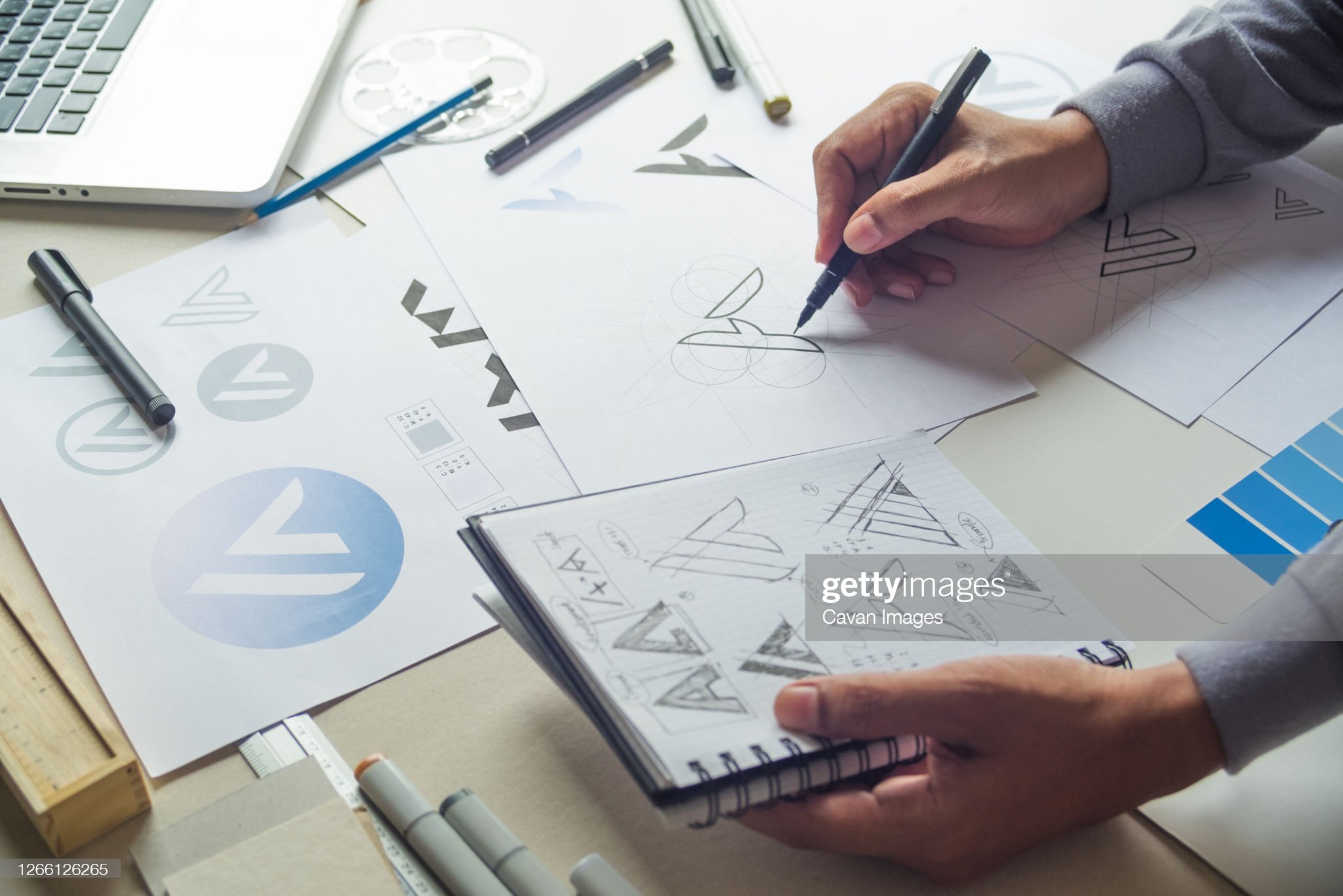
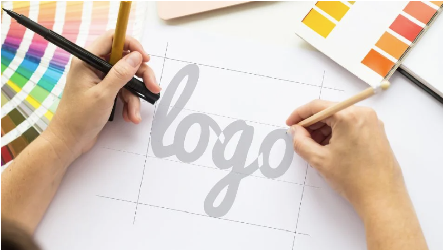
10 logo design trends

Logos, like everything else, have trends. It is useful to follow them so that the logo looks relevant and does not seem outdated compared to competitors. We tell you what will be fashionable in 2023.
Trend 1. Gradient
The gradient does not lose ground and remains fashionable for several years now. In 2023, the gradient will also be relevant, so it should be safely used in logos.
The gradient is suitable for any company, especially those who seek to demonstrate modernity and manufacturability.

Trend 2. Subdued colors
A notable trend for 2023 is muted, dusty colors. In a year full of unpleasant events in the world, people want peace, harmony and softness, at least in color.
When choosing muted colors for the logo, it is better to choose a shade that is close to natural. This color scheme is especially suitable for companies broadcasting a commitment to sustainability.
 |
Trend 3. Non-standard geometry
In 2023, logos that feature geometric patterns in an unusual way will be trendy. For example, when shapes are combined with text or form a new object from several elements.
Logos with non-standard geometry have become fashionable quite recently, so such a logo will remain relevant for more than one year.
 |
Trend 4. Illustration
For playful brands, logos with an illustration, for example, in the form of an animal or a person, are suitable.
This option has an obvious advantage: the hero of the logo automatically turns into a brand mascot. The character drawn in the logo is convenient to use in social networks, on merchandise and in communication. Plus, hero logos are easier to remember.

Who will be able to quickly forget the sun, releasing clouds of smoke, and the shy bird?
Trend 5. Icons in text logos
One of the main trends of 2023 is icons in text logos. Companies often strive to make logos concise and minimalistic, but at the same time they want the logo to be memorable.
The text logo is concise, but not memorable. A logo in the form of a sign is memorable, but it is difficult to call it minimalistic. The perfect combo: a text logo in which a graphic symbol is added directly to the inscription.

Trend 6. Retro
Retro is a trend that is gaining popularity. Retro images in logos refer to the aesthetics of a certain time: from the Renaissance to the nineties.
A company using a retro-style logo conveys a connection with the era and hints that it has qualities that were then valued. For example, a logo in the style of the 1960s conveys the reliability and stability inherent in this time.

Trend 7. Minimalism
Minimalist logos have been trendy for decades. If there is a goal to make a logo for the ages, a simple sign without an excess of graphic solutions is the best choice.
Fashion is changing, but the Nike swoosh and Apple apple still look quite modern.

Trend 8. Neural networks
Neural networks are popular everywhere, including in the world of logos. A neural network is capable of creating a revolutionary option that a designer would not have come up with.
Neural networks do not think like people, so they boldly offer unexpected stylistic solutions and use colors that no one would dare to combine.
The best neural network for creating logos is Nikolay Ironov. He will develop 999 logo options in seconds, starting from information about the company. Here are the logos Ironov has already made.

Trend 9. Creative typography
Another trend of 2023 is interesting typography. Brands will appreciate logos that combine type with graphics.
Letters in the form of birds and animals? Class. Does the font used for the brand name add up to a picture? Excellent.

Trend 10. Glitch
Glitch became trendy when TikTok released a logo with this effect. Since then, his popularity has not gone away.
Glitch adds futurism to the logos, and deliberate distortion makes the logo look longer (the eye clings to the “irregularity”).
Glitch logos are especially suitable for music and technology companies.

A source: https://ironov.artlebedev.com/ru/blog/post/trends/
.jpg)
Comments
Post a Comment
Thank you for your comment