If your logo looks like someone else's, that's fine. 5 arguments

Thousands of companies around the world use similar logos. But brand owners do not want their logo to look like someone else's, and they are ready to choose even an unaesthetic sign - as long as it is unique.
Don't be afraid to use a logo that looks like another company's logo.
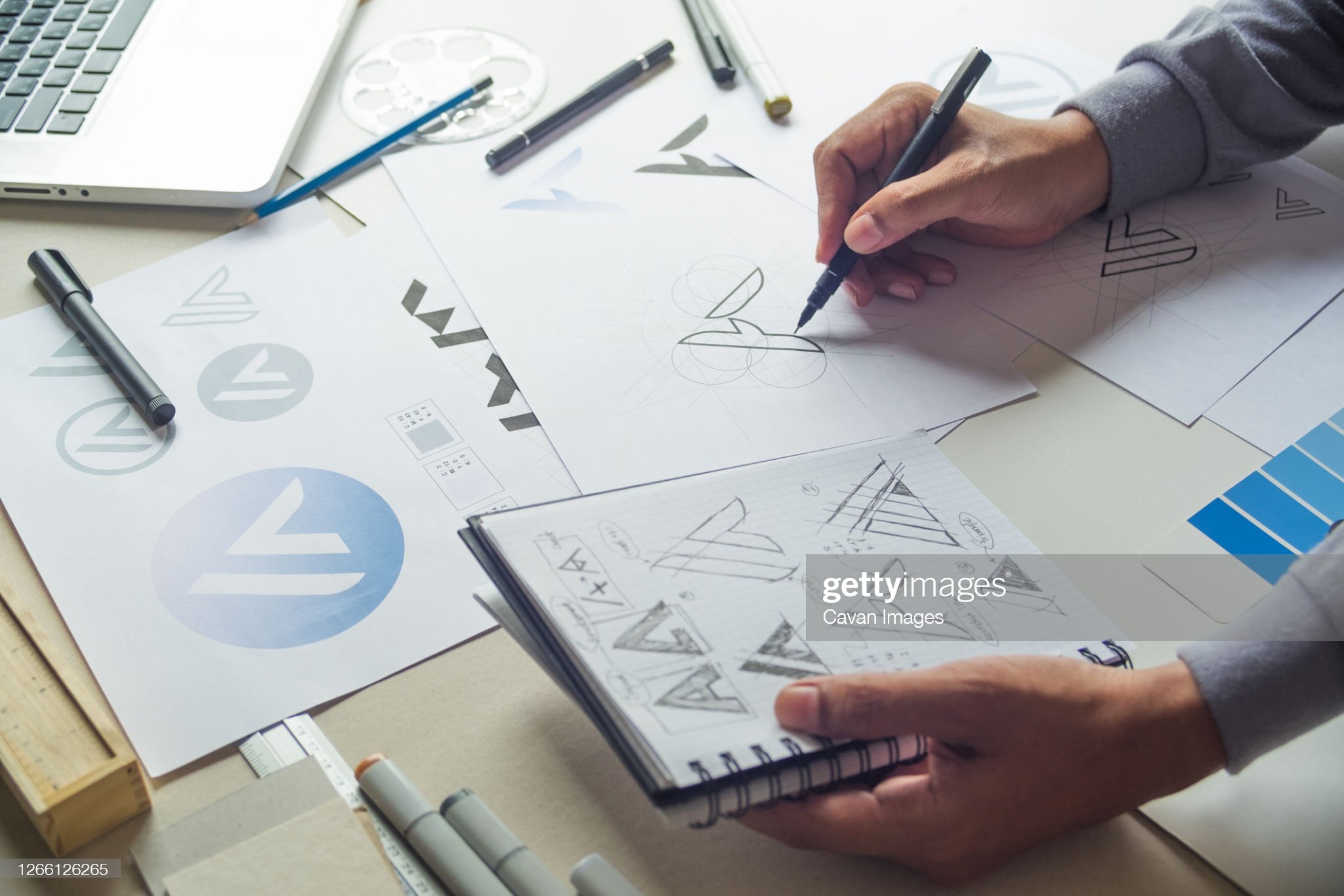
1. If the logo has a simple image, similarities with another logo cannot be avoided
The number of simple figures is limited. An apple, a circle, a square, a heart, an arrow, a tick and other simple graphic signs have a recognizable shape. Despite the fact that designers try to interpret the signs in their own way, a circle drawn by five different people is still a circle. It will look like another circle - and there is nothing to worry about.
.png)
The simpler the shape, the higher the chance that someone has already used it in a logo. This is fine.
2. There are thousands of companies around the world with similar logos.
The Pepsi logo is similar to the Korean Air logo.
.png)
The Ford logo is similar to the Carrier logo.
.png)
Many logos around the world are similar to each other.
.png)
3. The perception of the logo depends on the context
The graphic image does not exist in a vacuum and is determined by the context. Where does a person see the logo? How often? Under what circumstances? In which place? On what medium? All this is the context, and each brand has its own context.
When a passenger approaches a Korean Air plane, he is unlikely to change his mind about boarding because he will see a Pepsi-like logo on the wing of the plane. The thought “Wow, there is a sign like a Pepsi, this plane must be transporting soda” just doesn’t cross his mind. Because people know that Pepsi is in lemonade and Korean Air is in air travel. The similarity of graphic images does not affect this knowledge in any way.
.jpeg)
4. The law does not prohibit the use of a logo similar to another
In many countries, the law does not prohibit the use of a logo similar to that of another brand if two companies with similar logos operate in different areas. Problems will arise if businesses operate in the same field and sell similar products, and customers can confuse them.
So if a lingerie brand logo looks like a steel mill logo, don't run for a redesign. Most likely, the law is not violated in this case.
5. Similar logos have different meanings
The Versace and Starbucks logos are similar.
.png)
The Versace logo depicts the head of the Gorgon Medusa. She appeared in the sign because the brand's clothes can hypnotize anyone, just like Medusa. And the Starbucks logo has a siren. It was drawn because the brand's first coffee shop opened in Seattle, and the siren was the symbol of the city and the local port.
It turns out that two similar logos carry different meanings. The Versace logo is about the sophistication of the brand, and the Starbucks logo is about love for the place.
By itself, the graphic image does not mean anything. In order for the sign to have content, it must be filled with meaning - and this is the task of business. Similar figures will be perceived differently by people depending on the context. The square drawn in the logo of the construction company reads like a brick and a symbol of the brand's reliability. And the square drawn in the logo of the printer manufacturer is perceived as a sheet of paper.
Conclusion: Don't be afraid to use an image that someone else is using. If you put your content into it, everything will be fine.


Comments
Post a Comment
Thank you for your comment